Projects
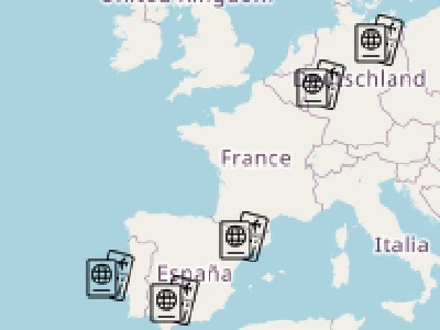
Leaftlet Popups
Web mapping with popups made using Leaflet

Web Mapping
Made with QGIS, Leaflet, and Mapbox
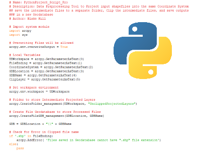
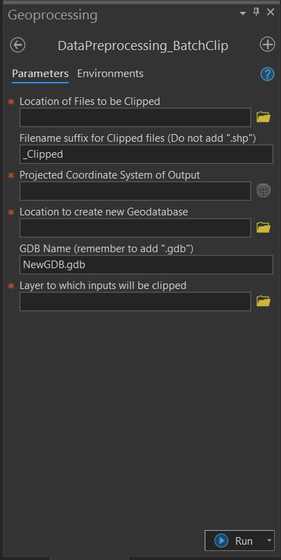
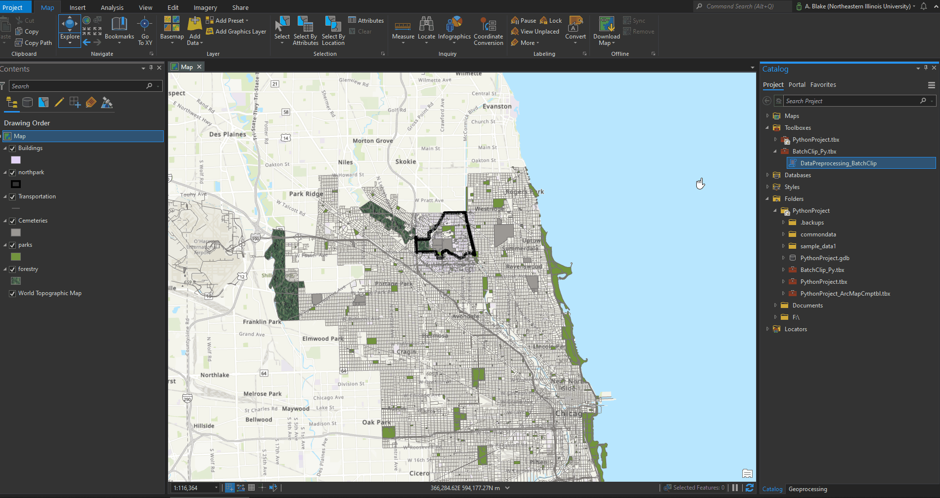
Python
Custom geoprocessing tools using arcpy
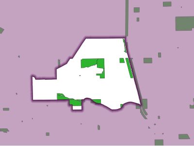
Inverted Polygon
Tutorial for QGIS
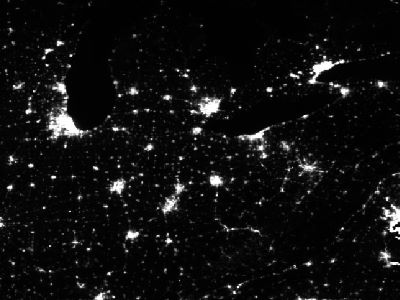
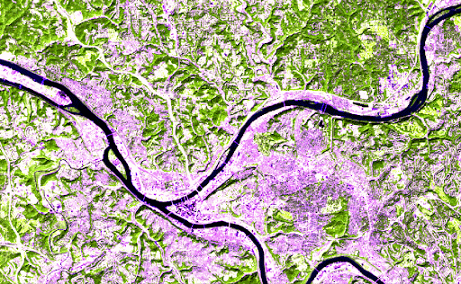
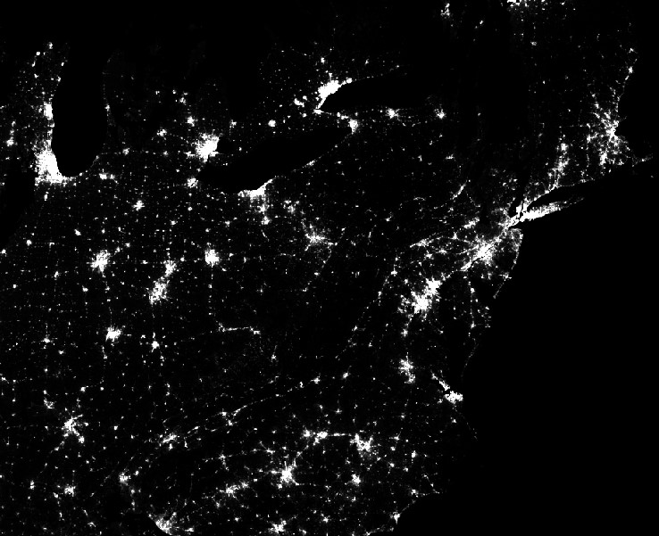
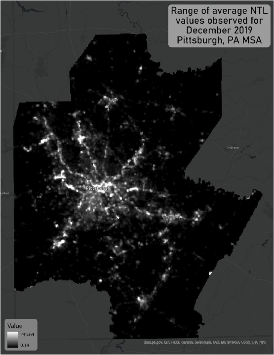
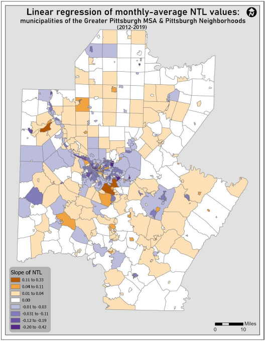
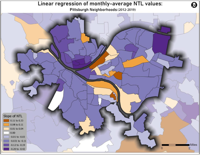
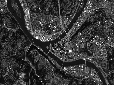
Nighttime Lights
Remote sensing with nighttime imagery
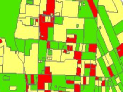
Layer Blending
Symbology in QGIS for overlay analysis
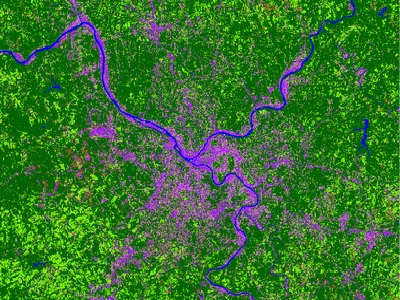
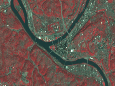
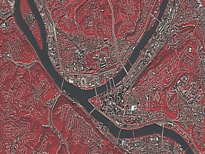
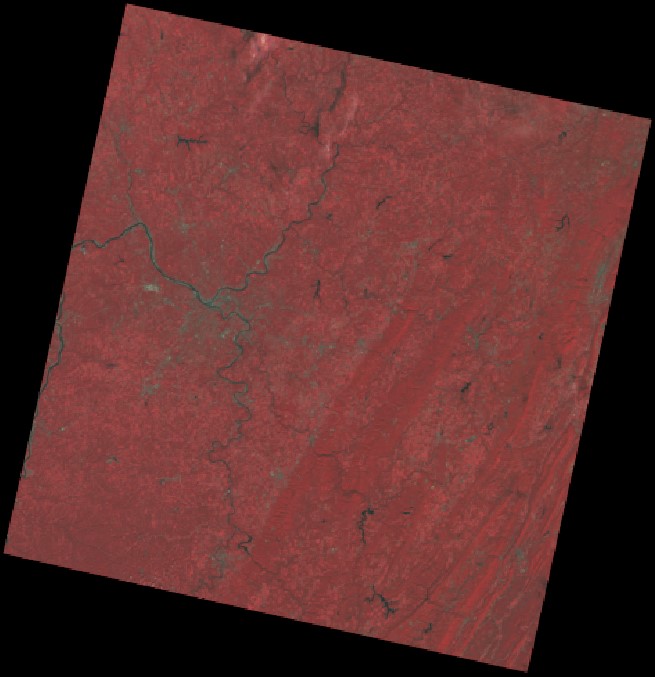
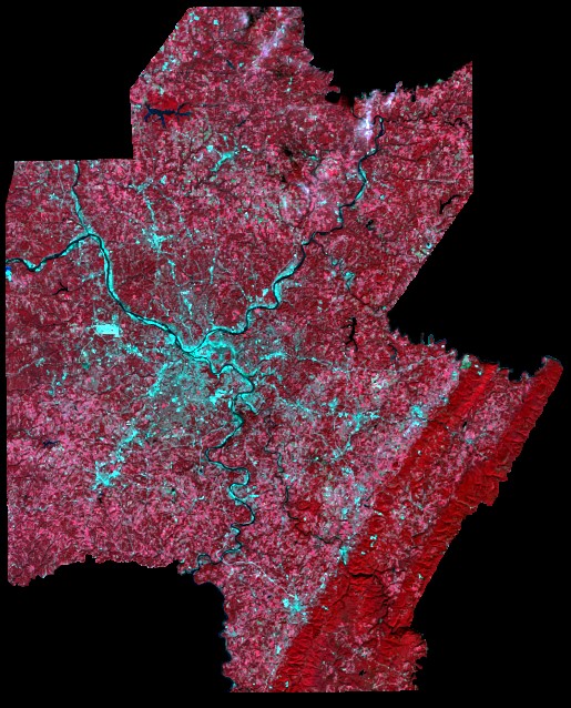
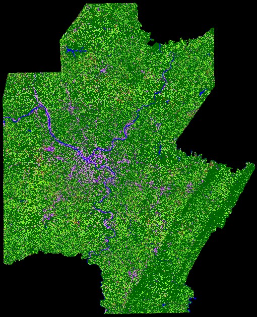
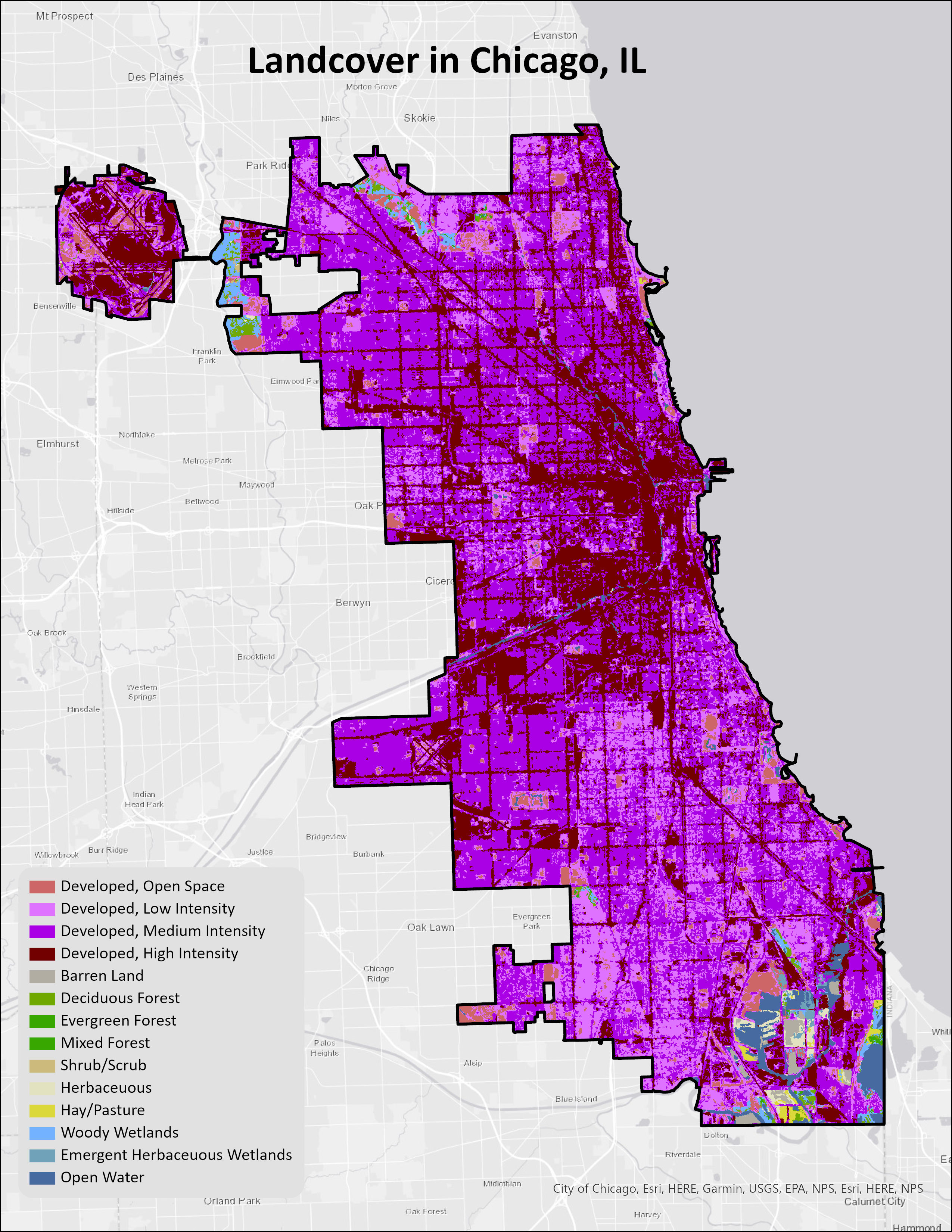
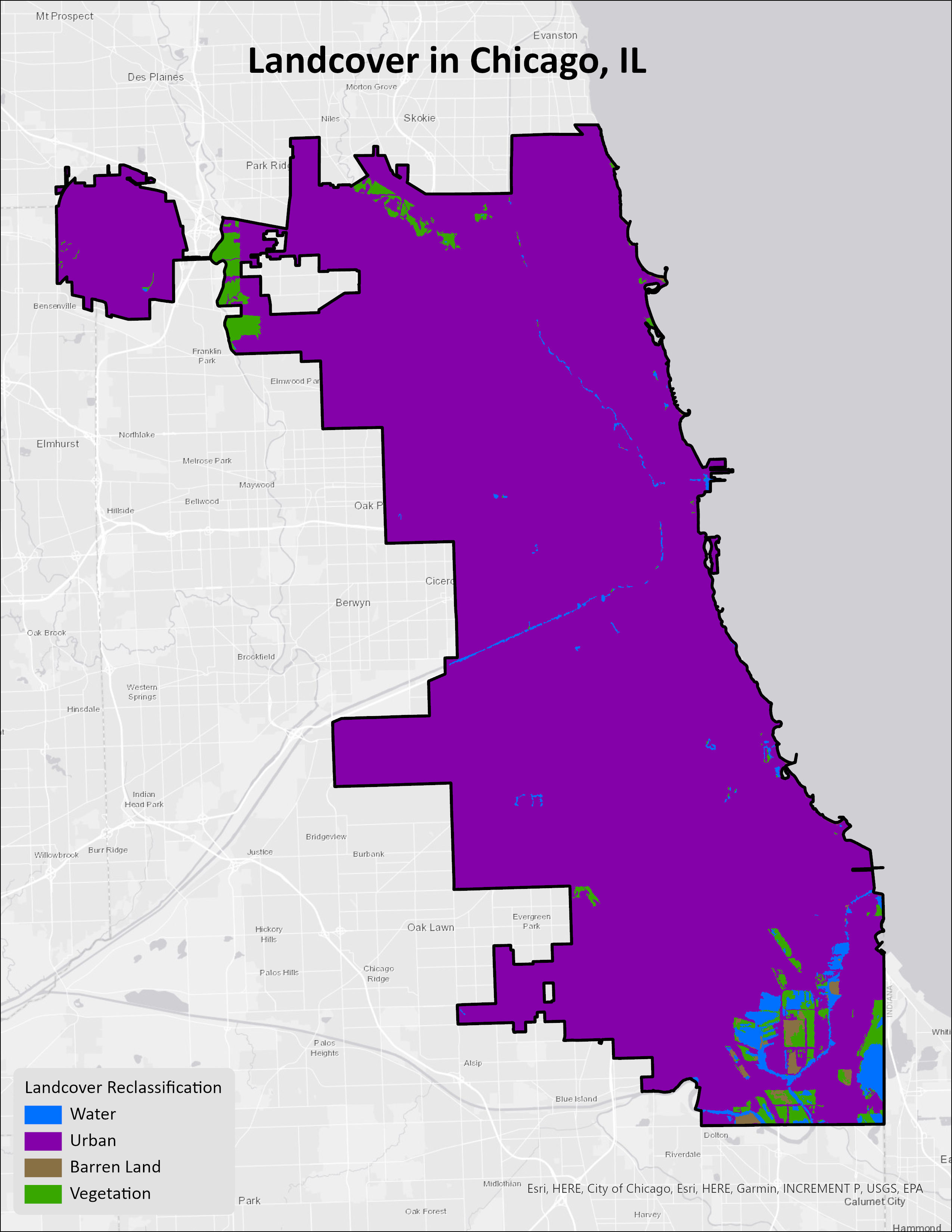
Remote Sensing
Supervised & Unsupervised Classification
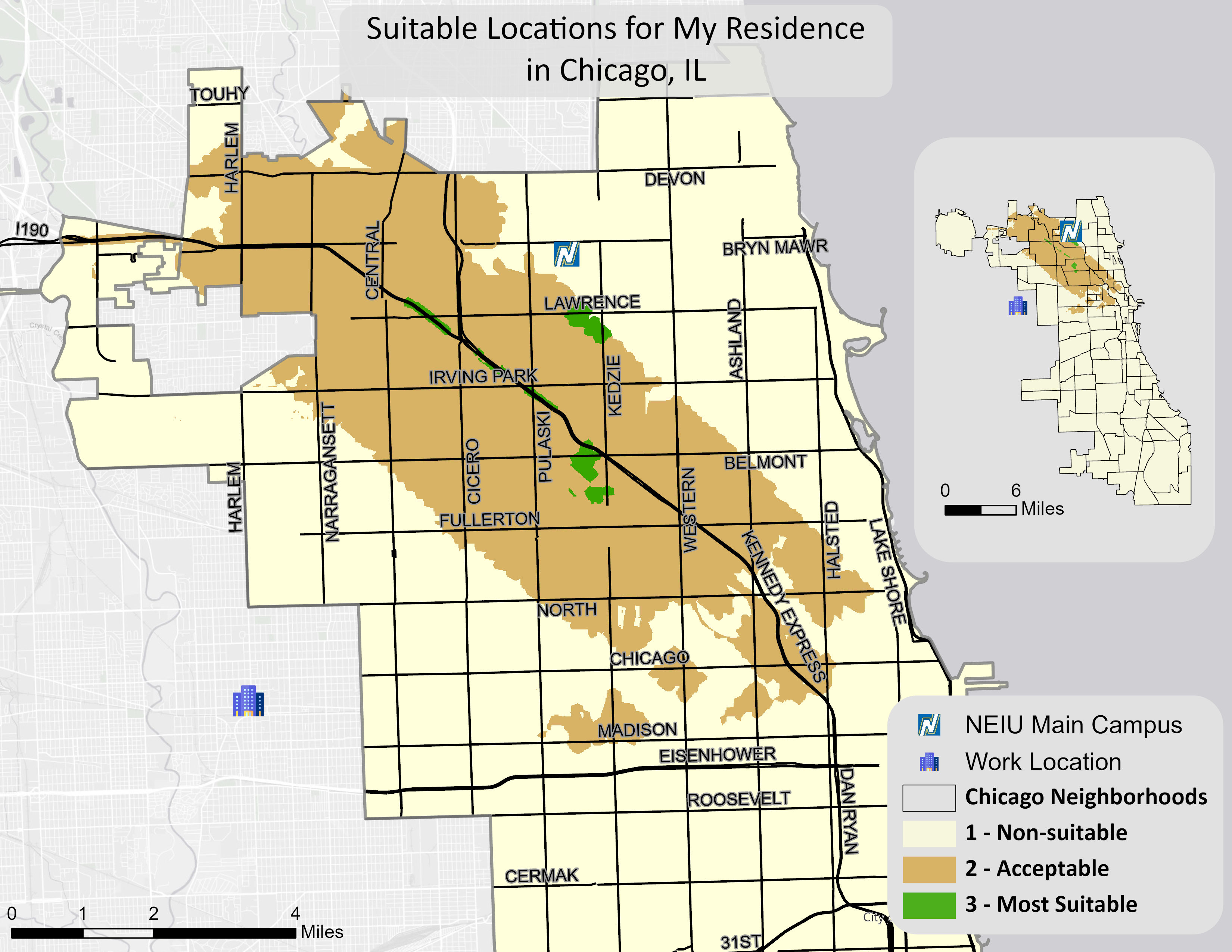
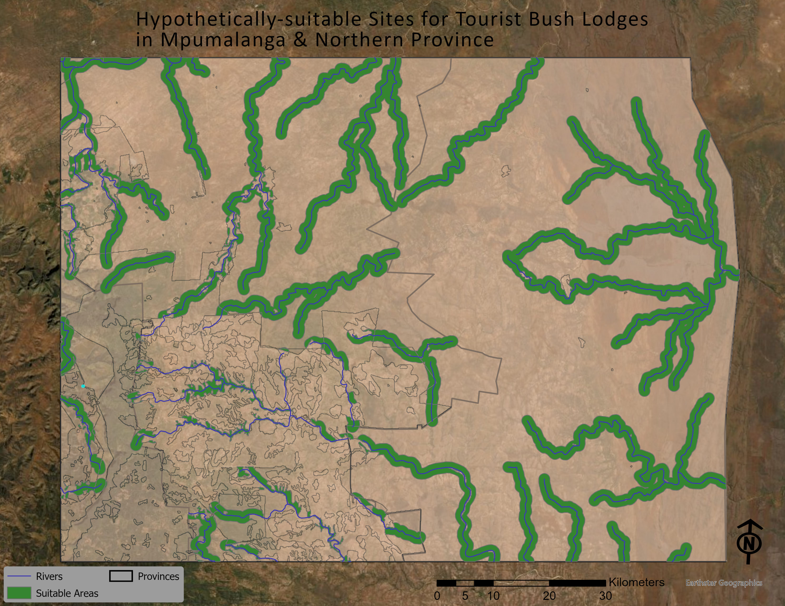
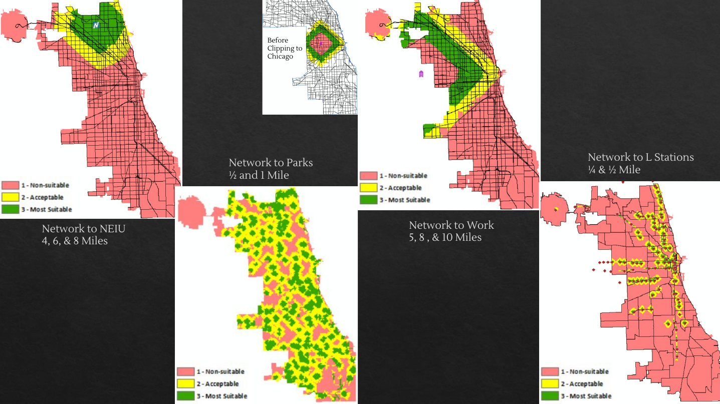
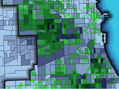
Multi-criterion Evaluation
MCE of suitable locations
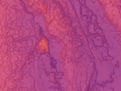
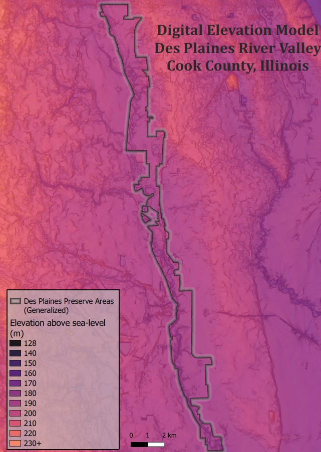
Digital Elevation Model
DEM produced in QGIS
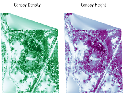
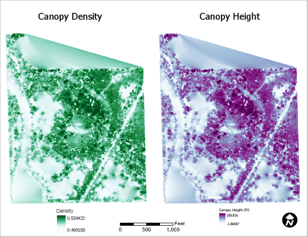
Tree canopy - LiDAR
Canopy measurments from point cloud data
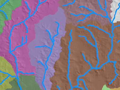
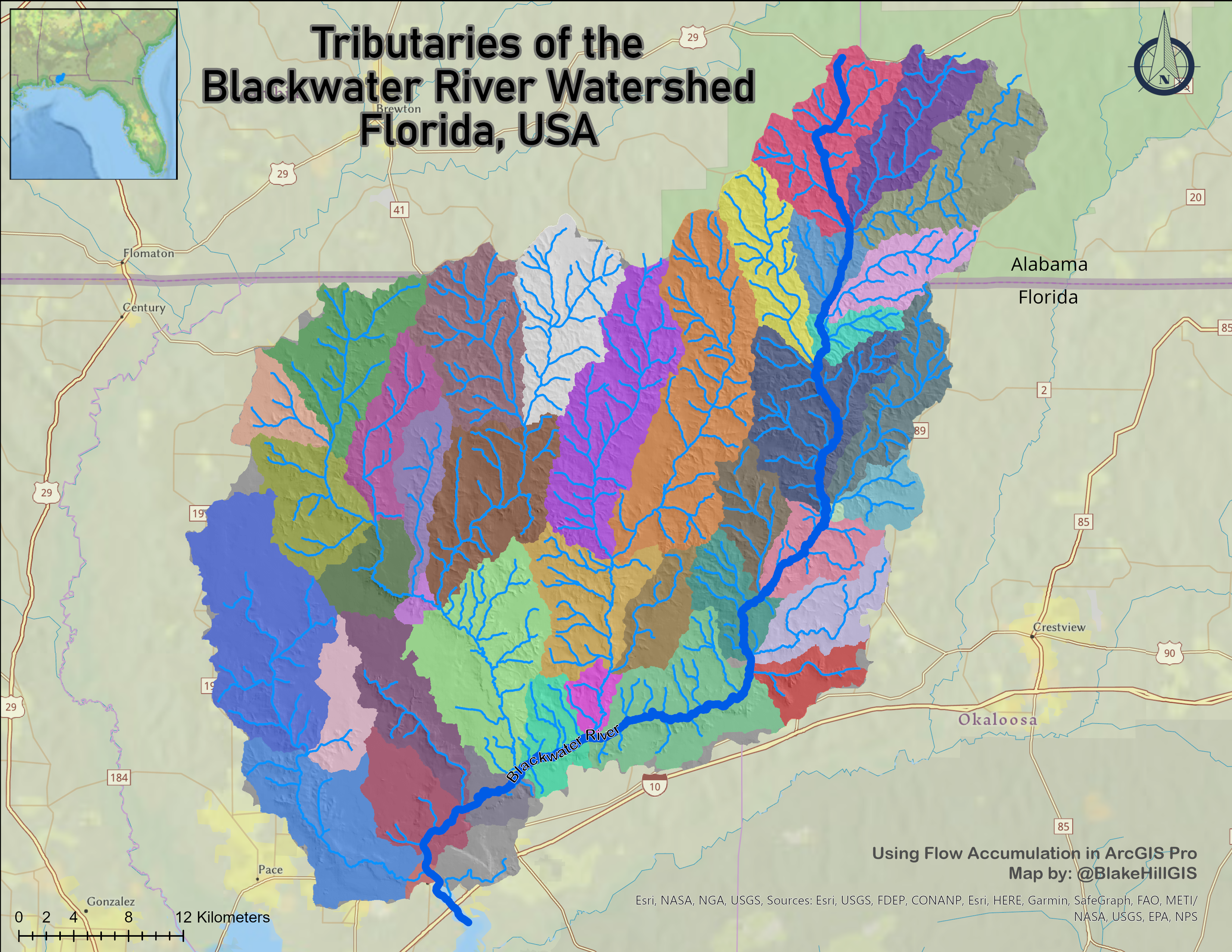
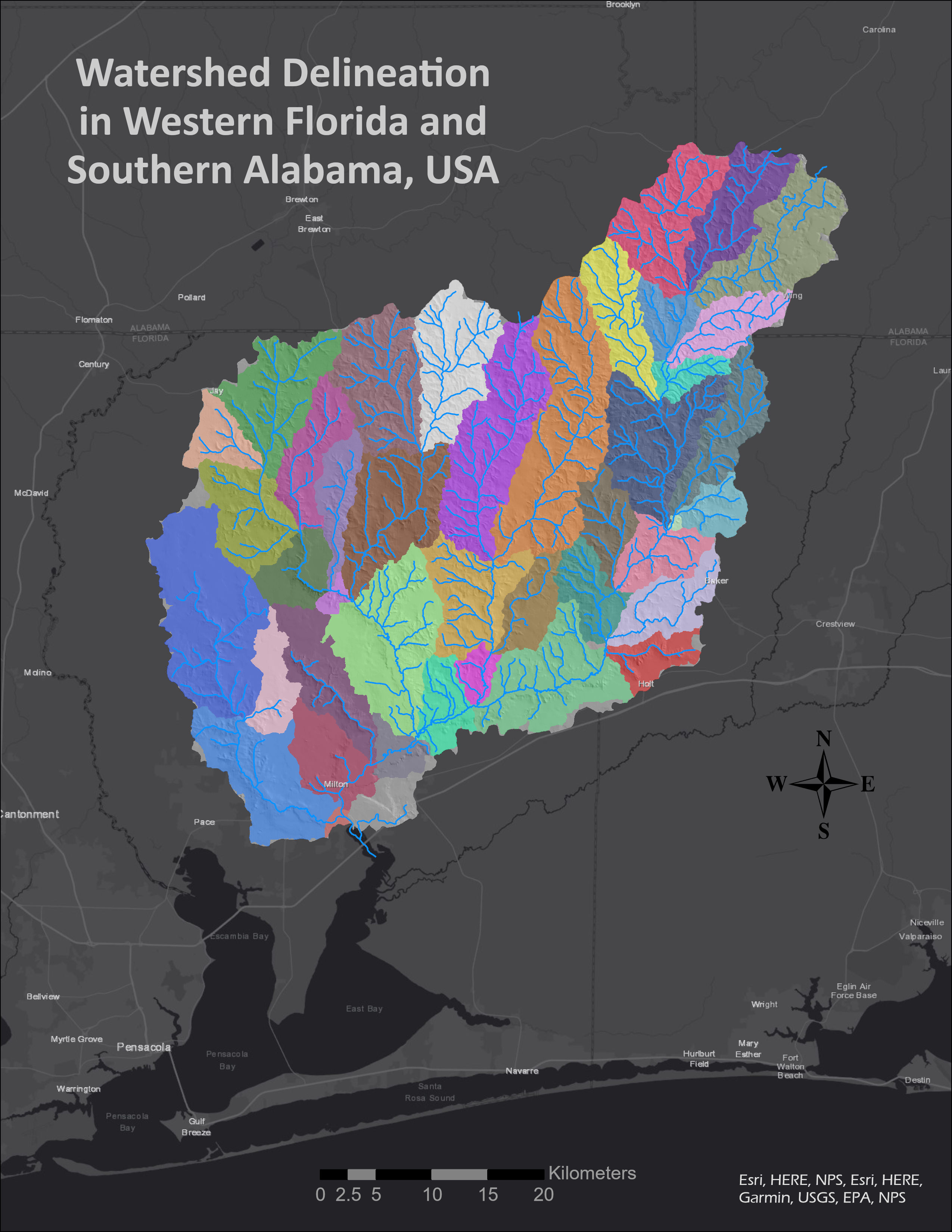
Watershed delineation
Flow Accumulator in ArcGIS
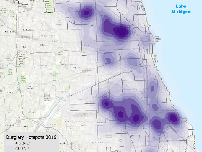
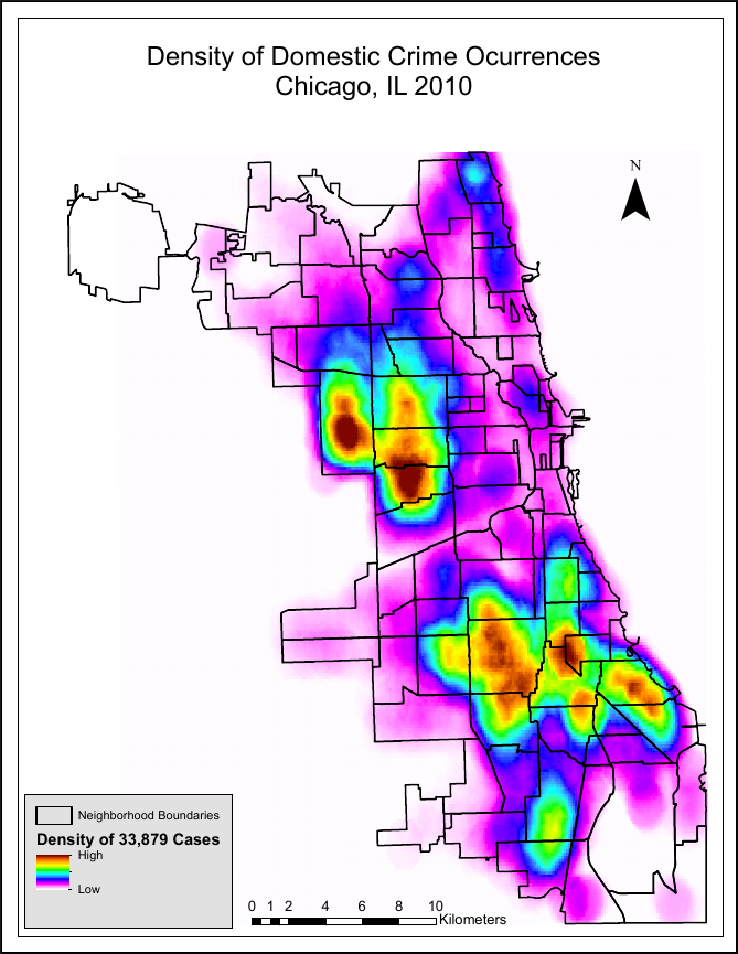
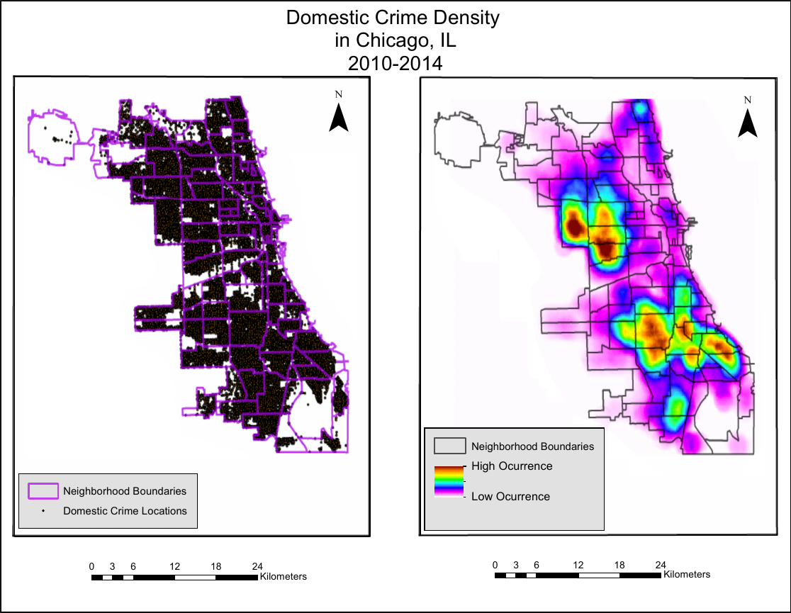
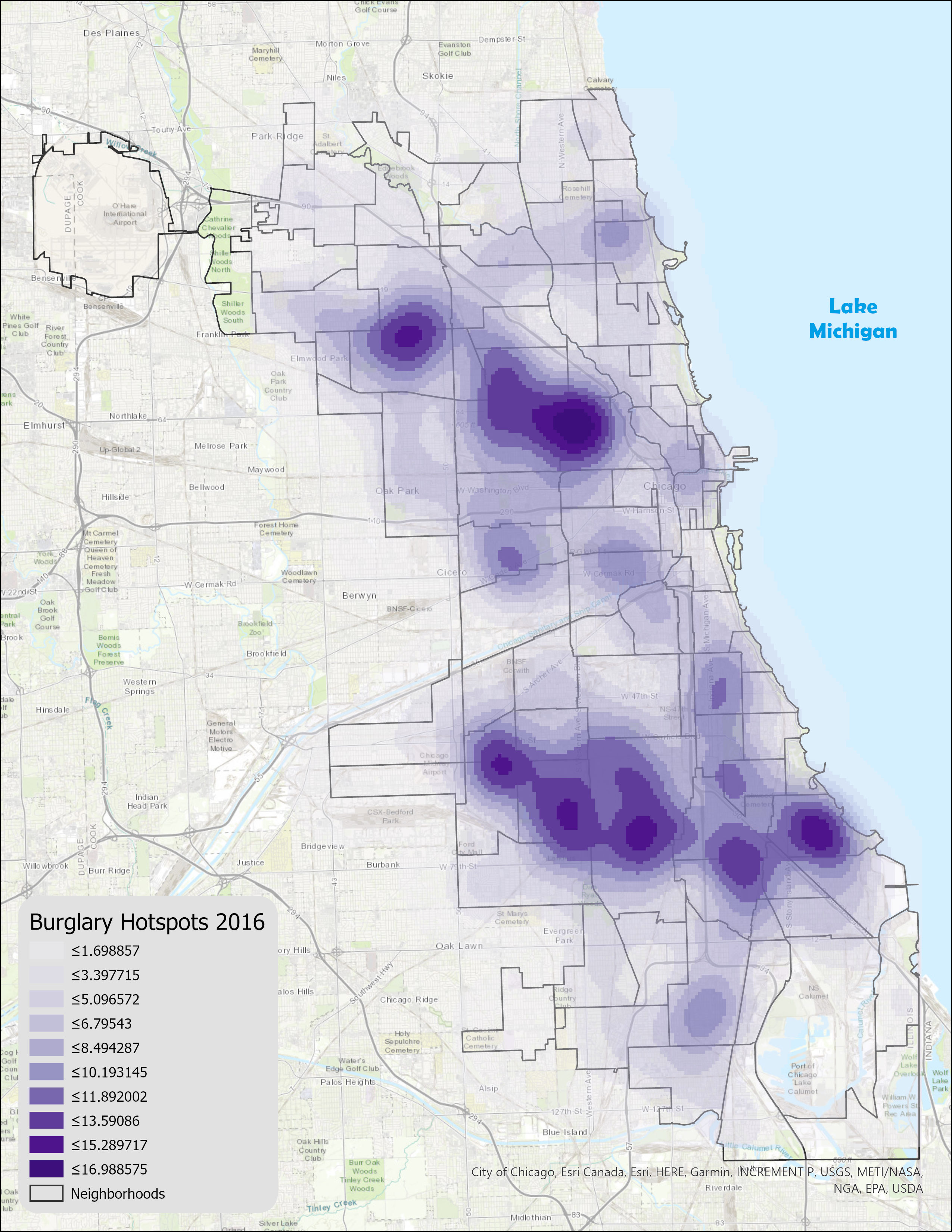
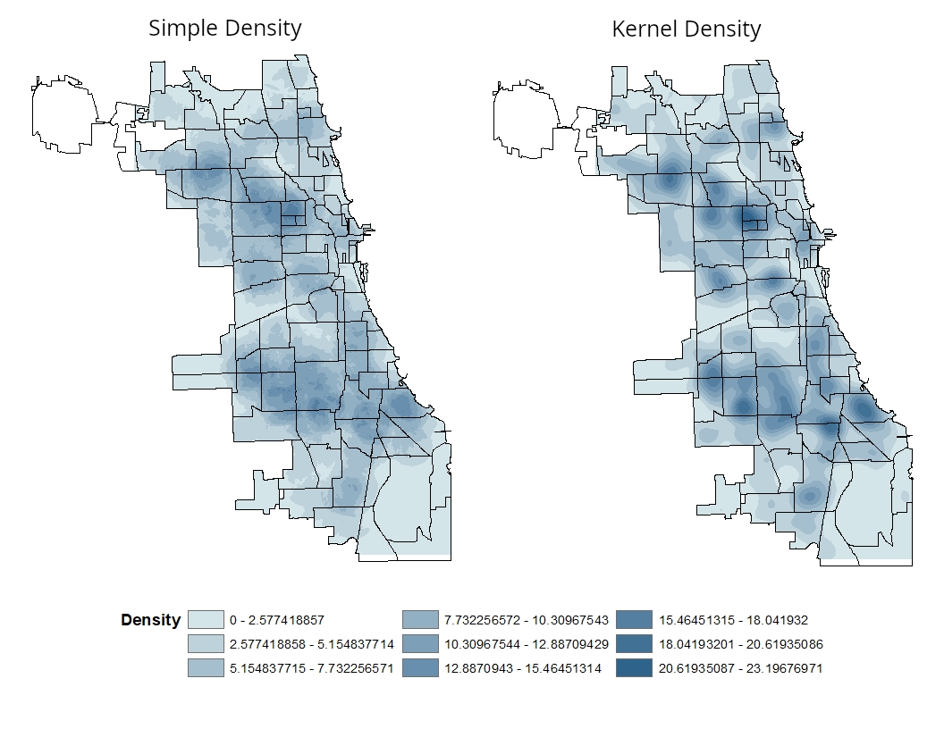
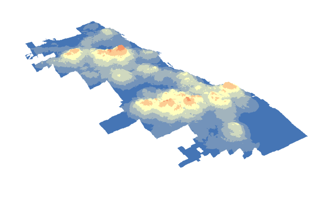
Density Mapping
Kernel density in ArcGIS
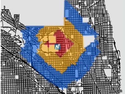
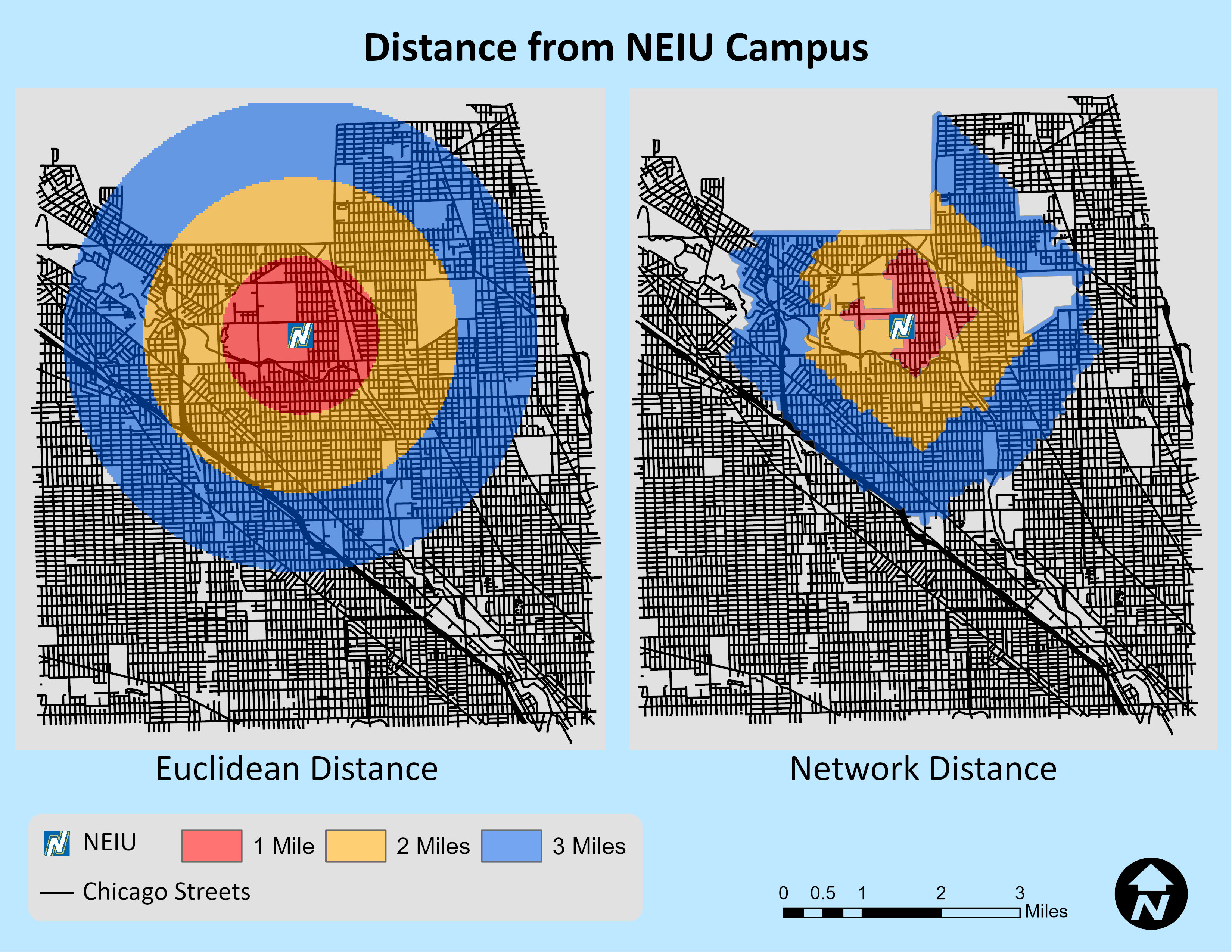
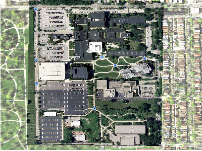
Network Analyst extension
in ArcGIS
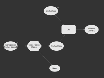
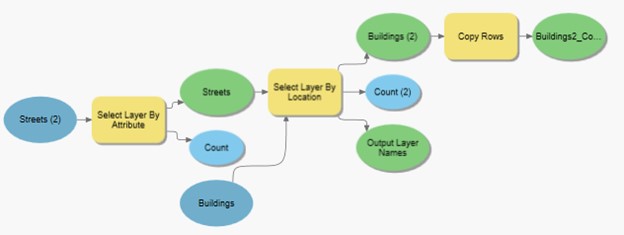
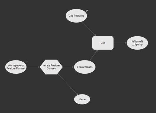
Model Builder
Geoprocessing tools & iterative processes
Agent Analyst
extension in ArcMap
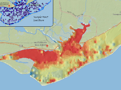
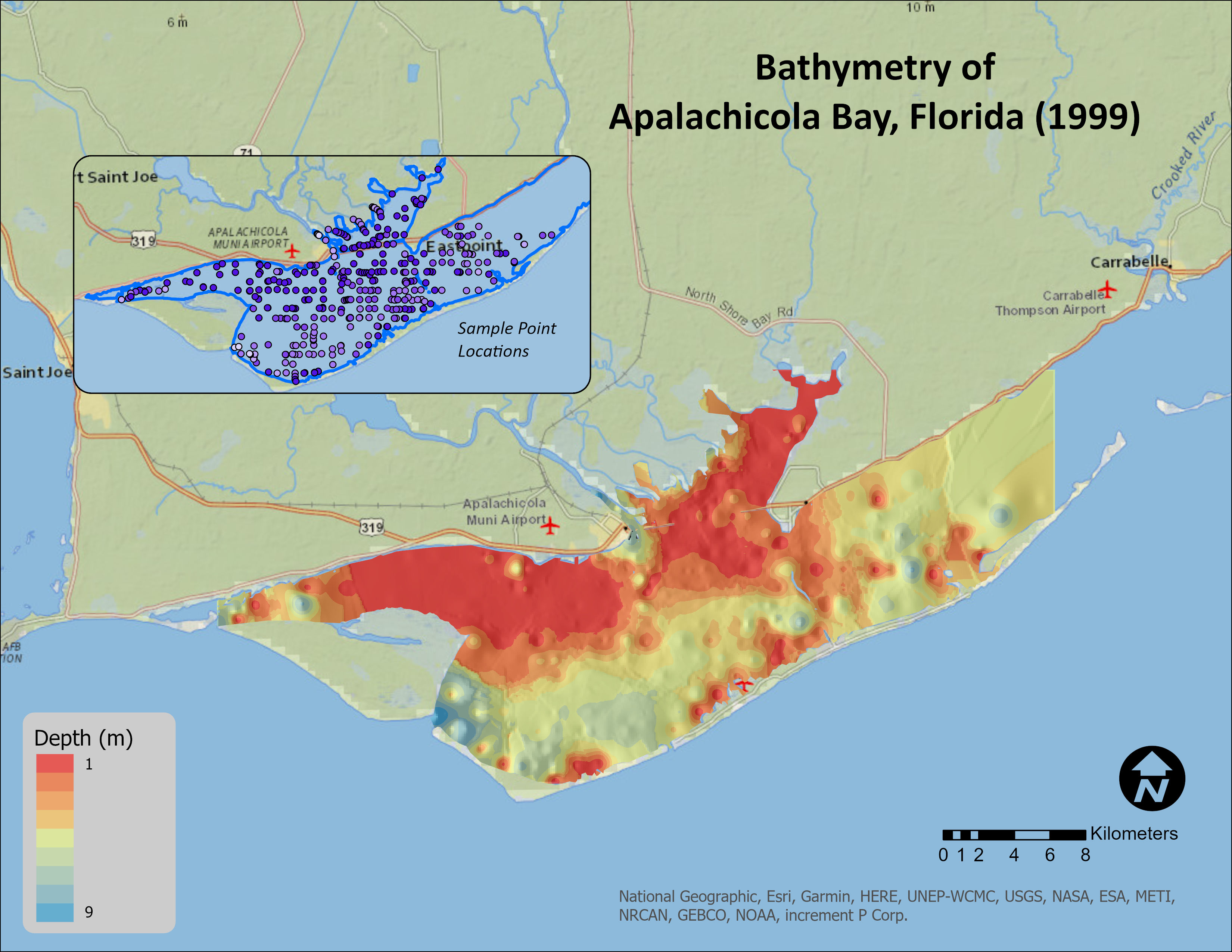
Bathymetry
Apalachicola Bay, Florida
Georeferencing
imagery in ArcGIS
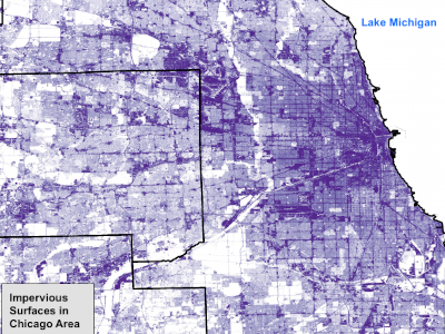
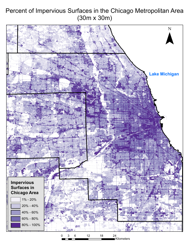
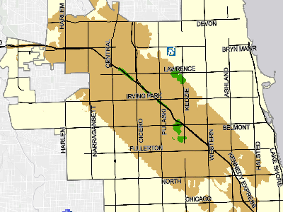
Impervious Surfaces
From the 2011 NLCD dataset

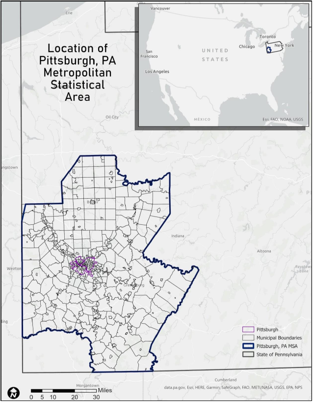
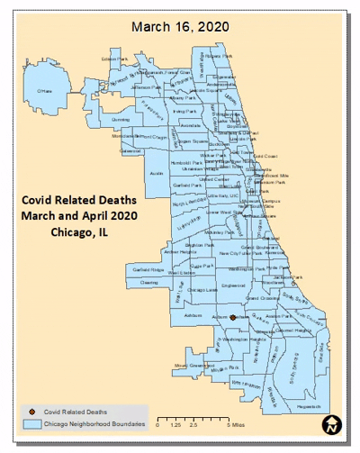
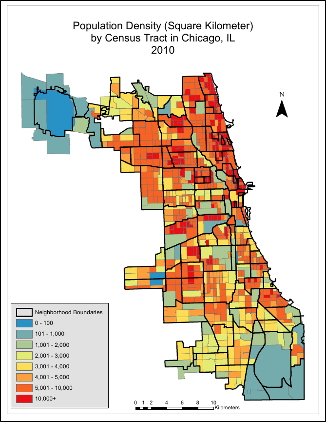
Demographic Data
U.S. Census and American Community Survey
Pansharpening
Using ERDAS Imagine and Landsat imagery
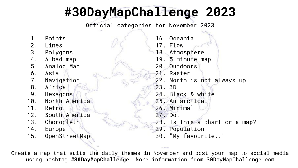
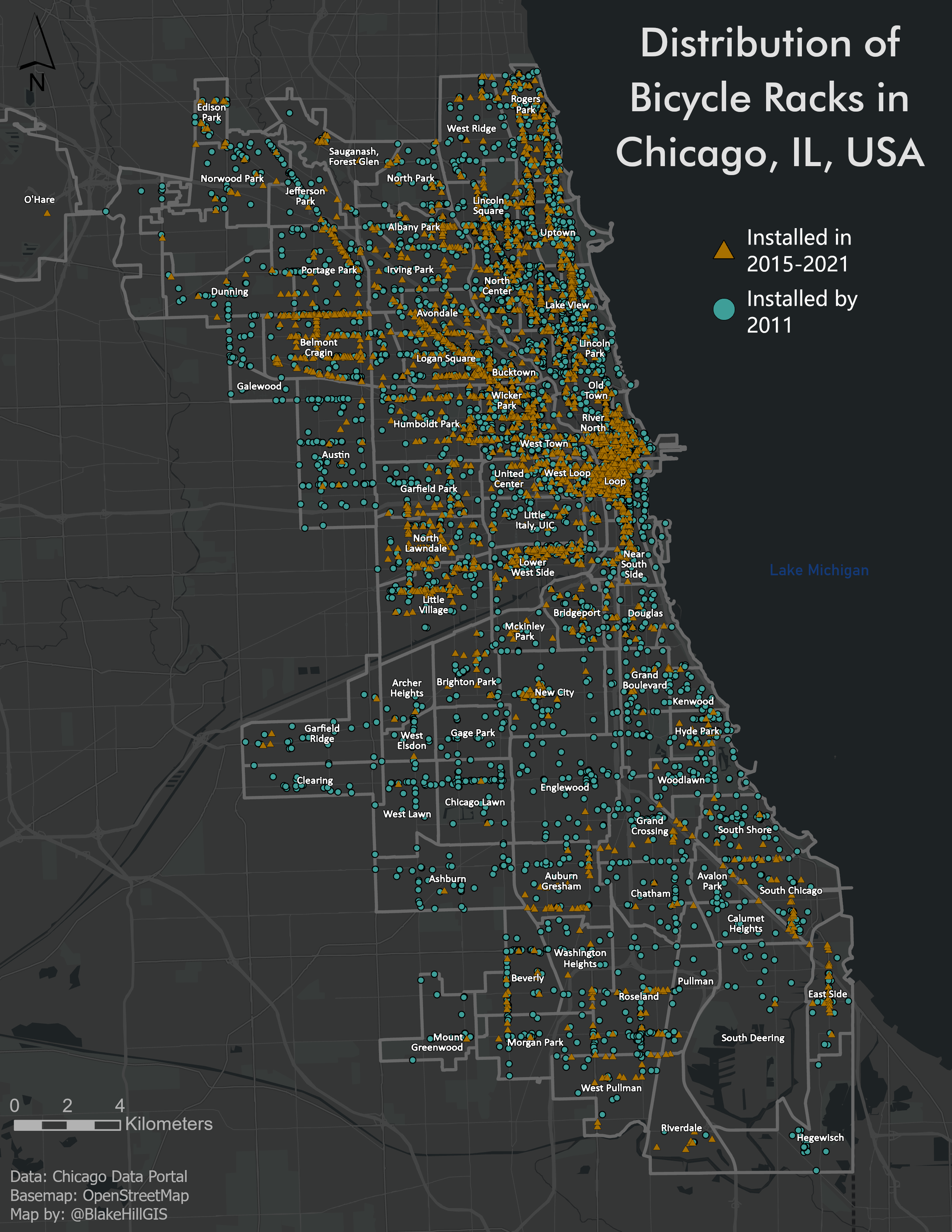
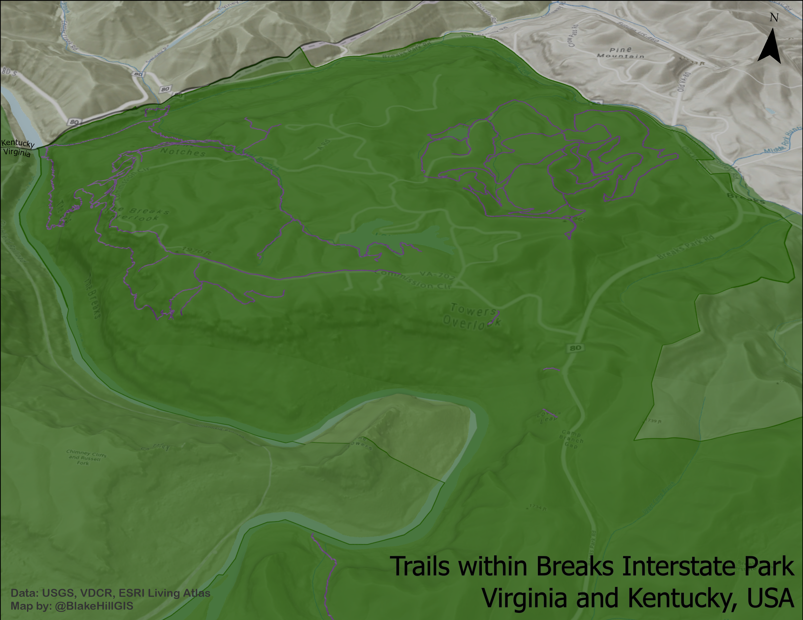
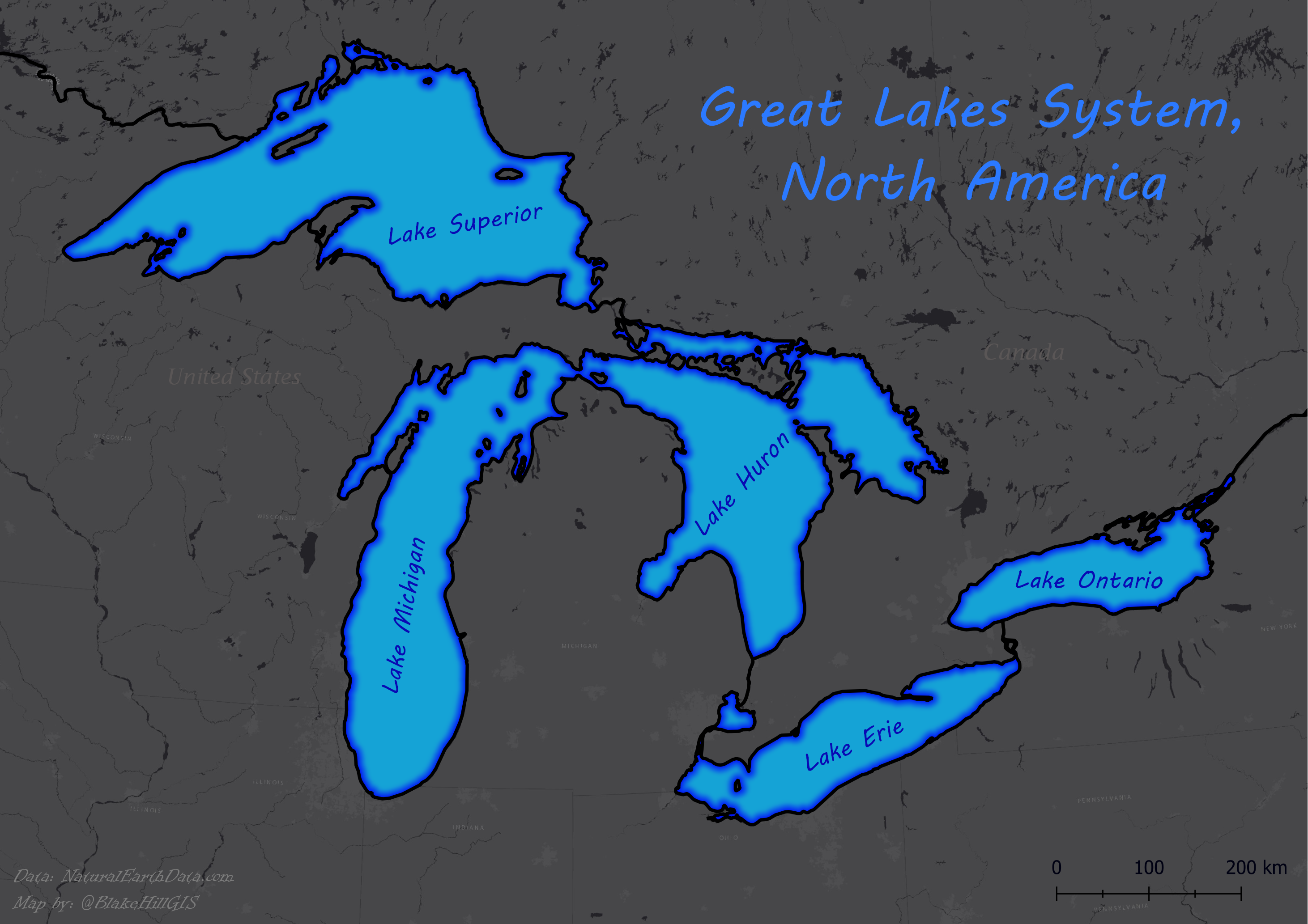
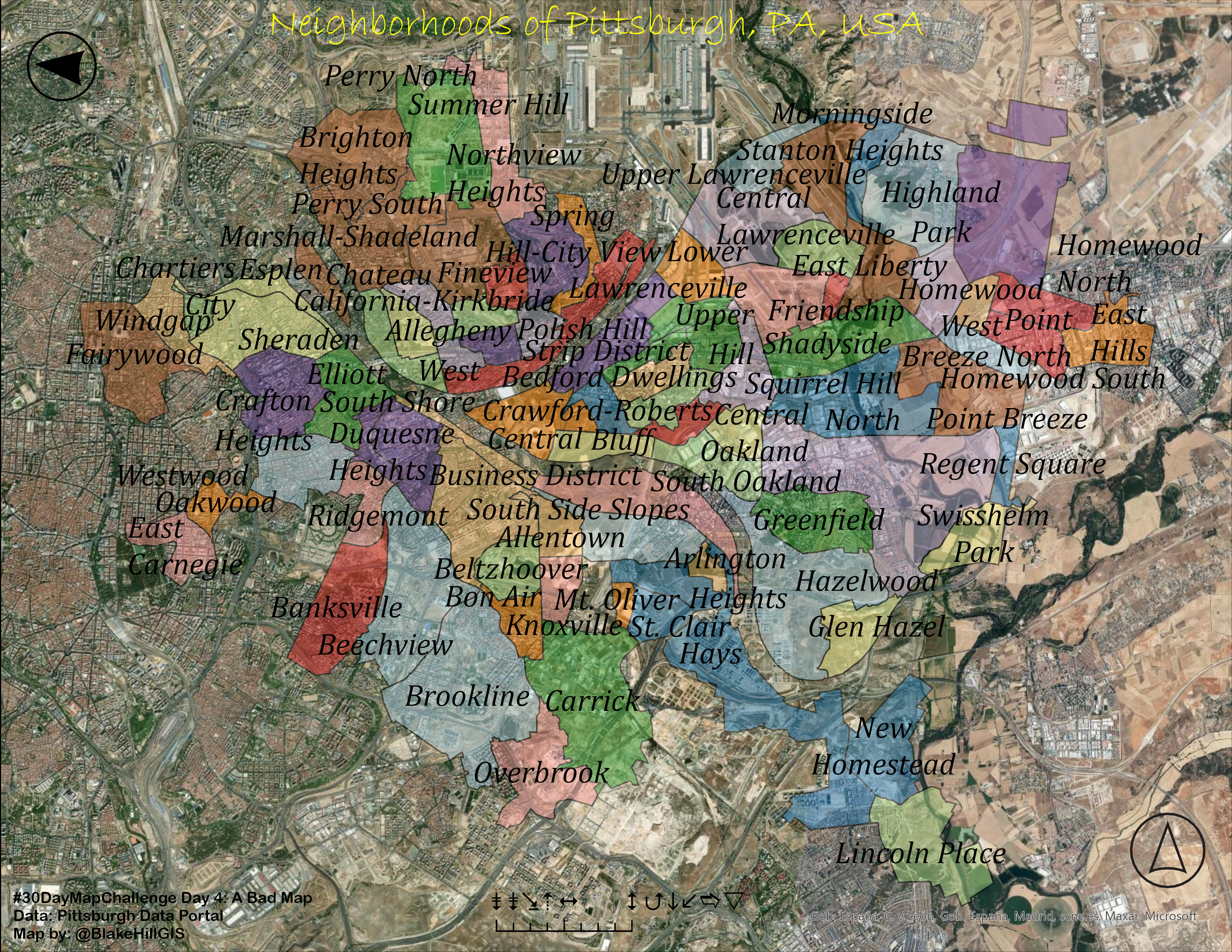
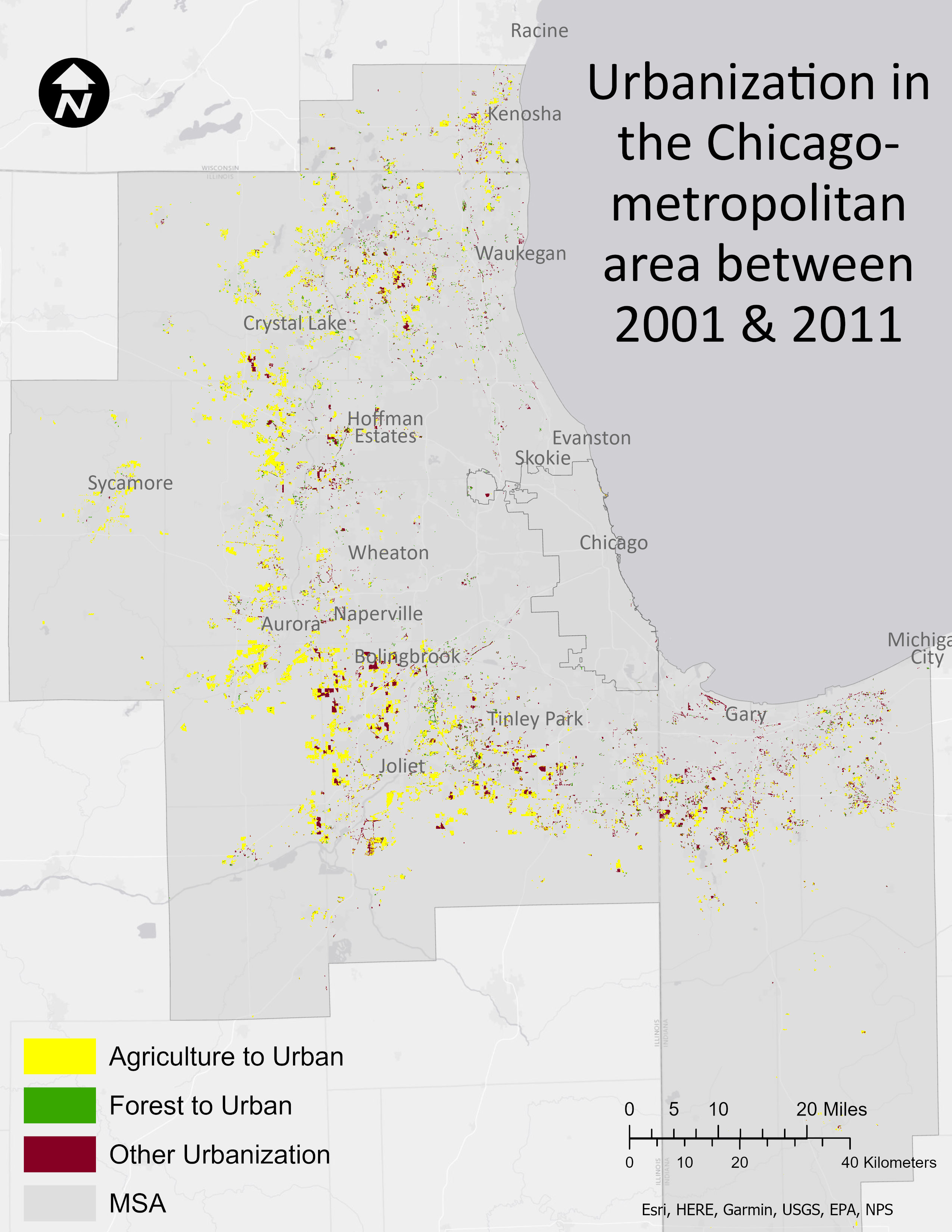
30 Day Map Challenge
2023

ESRI Training
MOOCs and Instructor-lead Trainings